@kat_fil
cAtarina *

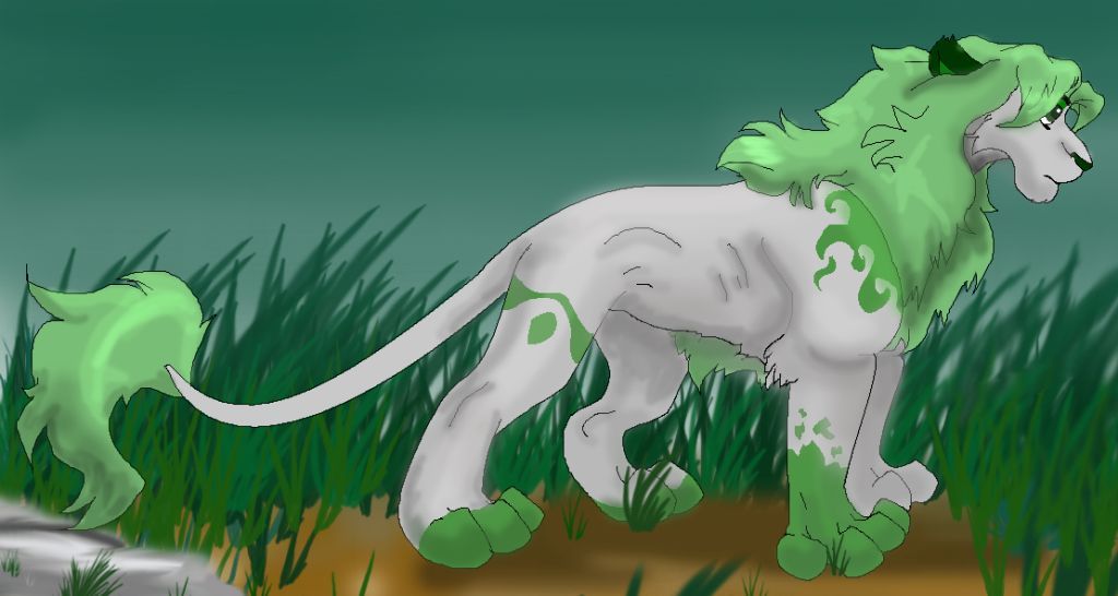
Contest pic
Contest pic by @kat_fil (cAtarina *)

This was for a contest...=P

I should realy work on my backgrounds...

Category:
Rating:
Everyone
Class:
Undefined
Submitted:
18y159d ago
Tags:
None
Other Work By @kat_fil

Comments & Critiques (3)

Preferred comment/critique type for this content: Any Kind

Posted: Wednesday, 14 June, 2006 @ 05:57 PM

This is cooool!! i luv the pattern and the green! the background is awesome, keep up the awesome work!

Posted: Wednesday, 14 June, 2006 @ 06:02 PM

This is cooool!! i luv the pattern and the green! the background is awesome,

keep up the awesome work!

Posted: Thursday, 15 June, 2006 @ 05:48 PM

Despite what you say I think the background is great! It isn't too bold as to block the main character, and it isn't too faded to the point it isn't worth being there. It's just perfect! And the lion is beautiful, I love the colouring, it all flows. And it's green, and I love green. HURRAH! o.o

ooo and the markings are very cool!

Leave a Comment

You must be logged in and have an Active account to leave a comment.
Please, login or sign up for an account.

What kind of comments is kat_fil seeking for this piece?

  • Any Kind - Self-explanatory.
  • Casual Comments - Comments of a more social nature.
  • Light Critique - Comments containing constructive suggestions about this work.
  • Heavy Critique - A serious analysis of this work, with emphasis on identifying potential problem areas, good use of technique and skill, and suggestions for potentially improving the work.
Please keep in mind, critiques may highlight both positive and negative aspects of this work, but the main goal is to constructively help the artist to improve in their skills and execution. Be kind, considerate, and polite.