Everyone who sees this takes one look at it and tells me that "it's not pretty". Xb THANK GOD for people like you, Grinn! XD And I've gotta agree, the red and black panel is my fav, too. Thanks alot for the comment!

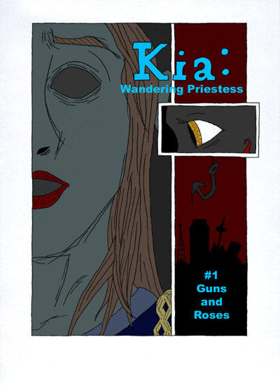
Kia: Wandering Priestess cover by @devthemagister (Devon Thompson)
The cover design for the first Kia comic. I want each story title to have something to do with heavy metal, but still be relevant to the story.


I always loved this one. It's so mysterious and strange. The lighting on the large panel on the left makes me think "under ground". I like that. The red and black panel is my favorite though. It's so simple but conveys a lot :)
Keep it up!