@Lady_Amberjo
Lady Amberjo

Motivation
Motivation by @Lady_Amberjo (Lady Amberjo)

please do not use or post this image elsewhere

...and finally, it's done. Whee!

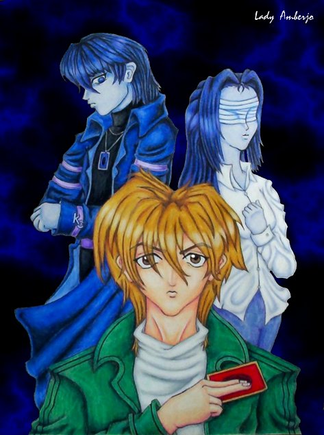
Two driving forces for Jounouchi: Shizuka has unwavering faith in her brother. Kaiba considers him mediocre at best, and a dog much of the rest of the time. Providing him with motivation for dueling...proving Kaiba wrong, and refraining from letting his little sister down.

This picture took forever and a day, but it was worth it...my first time drawing Jounouchi and Kaiba (in non-chibi forms, anyway)...first attempt at different positionings...first attempt at drawing detailed hands...first attempt at fabric folds...first attempt a light-reflections in hair...first attempt at...quite a lot, actually. o_O

Originally I had them all in their Battle City outfits...but then I realized I wanted to use my parrot green, and so Jou's outfit was switched. Then I realized that I hate Shizuka's BC outfit...horrible frumpy thing...and opted for a blouse that would give me a chance to practice folds. Then realized that Kaiba's white coat didn't fit in with the theme I wanted, having the more positive form of motivation (Shizuka) in light colors, and the negative (Kaiba) in darker tones. Finally, Kaiba's wardrobe just wouldn't cooperate, and after some playing around I just opted to design something new for him. And it was fun. Must design more outfits for the boy at some point...

This picture's been in-progress for so long, it feels weird to have finished it...I guess I'll have to start another long-term project soon. ^^;

Done in Prismacolor pencils and Sakura micron pens, with touch-ups and background done in Paint Shop Pro.
Category:
Rating:
Everyone
Class:
Finished Work
Submitted:
20y71d ago
Tags:
None
Other Work By @Lady_Amberjo

Comments & Critiques (8)

Preferred comment/critique type for this content: Any Kind

Average Rating:
(5)

Posted: Friday, 10 September, 2004 @ 09:53 PM

It's finished! Whee! ^^

...And damn those colors are good. The shading is beautiful, and vivid and really nicely detailed... especially on those folds. Those are nice clothing folds. And the hair is just shiny enough. ^^

The background is nice and simple, and goes along well with the rest of it... distinctive enough to add to it, but not distracting from the characters....

And of course, pictures with meaning are especially special.... Eee, this is pretty....

Posted: Friday, 10 September, 2004 @ 10:01 PM

tacklesnugs Yee, my first comment on my long drawn-out picture!

I've discovered that digital camera is better for preserving color and detail than scanning...some was still lost in the upload, though...but no matter! ...I'm still a bit annoyed with how it wonked the shading on Kaiba's coat, though. The colors don't really look like that in real life. o_O

Folds are a pain ^^;; But now I know how to draw them, so they don't hurt as much...it was a very educational project, this pic...

snuggles madly again for commenting

Posted: Tuesday, 14 September, 2004 @ 01:06 AM

Oh, it's absolutely beautiful! in awe of the folds. Yes, you did them perfectly! And I love how Seto and Serenity both are in "shadow," kind of, and not really being colored normally. The idea of Serenity wearing white while Seto wears dark clothes was a good one. It all helps to convey the meaning of the pic! ^_^ I think I said this on my comment for the B&W version, but I love Joey's determined expression!

Posted: Tuesday, 14 September, 2004 @ 01:29 AM

Oh, thank you muchly! ^__^

Oi, those folds...except for a very faint outline on the inside of Jou's sleeves, they were done entirely by shading weeps over the sad two-inch stub remains of her poor overworked colorless blender It served me well, the poor thing...

Heh, I like to think Kaiba and Shizuka aren't in the picture so much as they're the most important part of the most detailed and complex background I've ever put on a picture. XD

I'm glad you like the coloring ideas and Jou's expression ^^

Now...off to start some new excessively long project...

Posted: Thursday, 16 September, 2004 @ 07:37 PM

Oh, it's so beautiful now that it's finished! Your coloring has added volume to this image by accenting the foldings of the clothing nicely and the shading. I love how you've colored Kaiba and Shizuka to go with the background instead of using the vibrancy that you used with Jou. Helps to get your point across in the picture's meaning. You've done a wonderful job with the colored pencils and pens. ^_^

Posted: Friday, 17 September, 2004 @ 10:10 PM

Thanks so much for commenting ^__^

I almost wussed out on doing Kaiba and Shizuka in blue at the last minute...was sort of afraid of it turning out bizarre, having never done anything like it before...but I'm happy with the finished image. ^^

Thanks again, Cassie. ^^

Posted: Monday, 12 October, 2009 @ 10:23 AM
Rating: 5

Excelent picture, I really like how you did with this picture. Great detail, colors, depth, all so wonderful. I really like the style and how it illustrates "Joey". Great job! ^__~

Posted: Wednesday, 14 October, 2009 @ 08:04 PM

[quote="Weasel_Silver24"]Excelent picture, I really like how you did with this picture. Great detail, colors, depth, all so wonderful. I really like the style and how it illustrates "Joey". Great job! ^__~[/quote]

Wow, a star? Thanks so much!...I actually have no idea what the stars are for, I haven't poked around much since the launch, but thanks! It's my first star ever! XD

Leave a Comment

You must be logged in and have an Active account to leave a comment.
Please, login or sign up for an account.

What kind of comments is Lady_Amberjo seeking for this piece?

  • Any Kind - Self-explanatory.
  • Casual Comments - Comments of a more social nature.
  • Light Critique - Comments containing constructive suggestions about this work.
  • Heavy Critique - A serious analysis of this work, with emphasis on identifying potential problem areas, good use of technique and skill, and suggestions for potentially improving the work.
Please keep in mind, critiques may highlight both positive and negative aspects of this work, but the main goal is to constructively help the artist to improve in their skills and execution. Be kind, considerate, and polite.