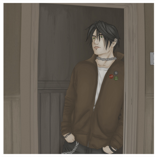
Yeah, I did back on the old Graffiti Wall! I think it was asking for help regarding the background. Totally forgot about that! Cheers for your comments. I have often thought that the eye looks off. I've tried moving but nothing seems to work. I kind of let it be in the end.

into a darkened room by @AfterDarkAngel (Dark Angel)
Haven't uploaded in ages. This is Roderick.
completed | Aug 27 2004
tools | Illustrator, Photoshop, Tablet
Comments & Critiques (4)
Preferred comment/critique type for this content: Any Kind


I remember seeing this picture before... did you post it to the forum asking for critique a while ago? Anyway, the shading of this image, especially on the walls, really stands out here. I love the pose, he looks very human and natural, something I don't see often, and can't quite pull off myself. His left eye looks a little too close to his nose, but it could be the angle throwing me off. Overall very nicely drawn and shaded.