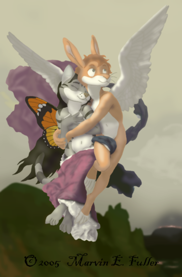
Thank you for your comment! I certainly am amazed at how well this came out. In regards to Psyche's toes, I see your point. At least they aren't the dreaded bubble-toes. :p Perhaps, in the future, I'll adjust them. I designed Psyche's wings sometime before I ever saw this painting, which is why they are so much more colorful than Bouguereau's version. The butterfly whose wings I used is a Plain Tiger (Danaus chrysippus), a Monarch-like butterfly native to the Mediterranean region, including Greece. I chose this butterfly because of its bright colors.
To make two characters look like they're interacting so closely, you need start in the beginning while they're still stick figures. One character (in my case, Cupid) is the one who is acting on the other; the other (Psyche) is the reacting character. The position of the reacting character's body should be determined first, as they are the one defining how strong the overall action is. Once you've figured out how the reacting character's body will be positioned, sketch in the stick figure of the acting character's body. Make sure the lines of action are simple curves which complement each other. (In this case, they are parallel.) Now that you've figured out where their bodies are, you can then put in the sticks and circles that will become the arms and legs. You will probably find it best to draw the circles for the future hands first before putting in the rest of the arm. This is especially a good thing to do if they're clasping hands like in a handshake. Once you've worked out where you want everything to go with the stick figures, then you can start building up the figures' bodies.
I hope that helps some.


Very cute picture. You captured the essence of the original painting well and really give a sense of them being together in this picture. I find that hard to do myself and often the characters end up looking flat and not touching each other. The lighting is nicely done and really gives shape to the characters. Psyche's feet could use a little work - the toes aren't quite right and the shape in general is a little jarring against the dark part of the background. Otherwise it's a lovely picture. I like the shape of your wings better than the original painting. What kind of butterfly wings are those?