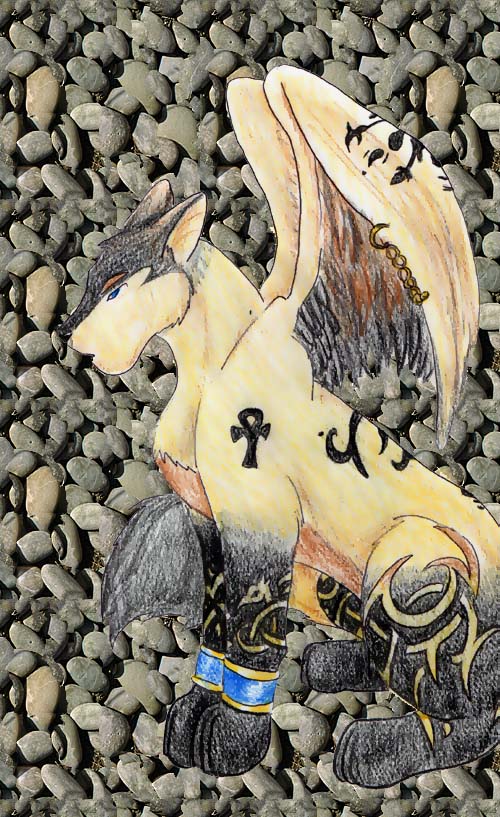
I likes! The marking on his leg are more Celtic than egyptian. Egpyptians liked lines and squares, things were more straigh, like how they were in hiroglyphics(sp?) but it's still cool looking. Does he have a name now? I like the chain thing on his wing, cool idea. His far back leg is a little too far back... (it would be his right back leg), it makes it look more like he's squatting with his legs that far apart, instead of sitting.. >.> (and you know what dogs do when the squat? lol Gotta pooper scopper? ^_~) Cool though, the bg though is kinda noisy for this picture, I would use a solid bg for it, to make him stand out more.

Lupine! by @Teiris (Kim Sova)
This is mah new lupey! He was supposed to be an egyptian lupe...but the markings on his legs don't look egyptian sooo...I dunno lol. Spin helped me out a bit with this one..I was shotting for burnt gold..but it looks stupid. And he dun have a name T_T argh Artwork © Copyright 2002 Kim Sova
Category:
Rating:
Everyone
Class:
Finished Work
Submitted:
21y344d ago
Tags:
None


Oooh! Likes dah wings ... very good .... keep it up.