@MOCHI
Vanessa Ho

Followed (2)
Followed (2) by @MOCHI (Vanessa Ho)

minor changes made

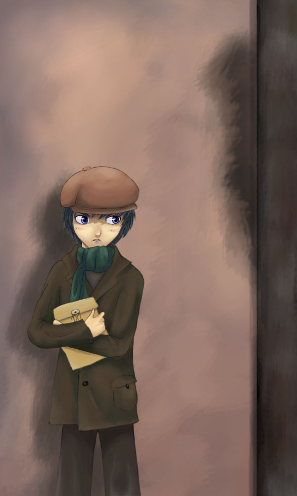
Second attempt at a more realistic/different style of colouring. Eyes are still big.... but i didn't want to draw realistic eyes lol....

Was supposed to have a much more detailed and sophisticated background....... maybe i'll do that later....maybe...=p

Category:
Rating:
Everyone
Class:
Finished Work
Submitted:
19y238d ago
Tags:
None
Other Work By @MOCHI

Comments & Critiques (2)

Preferred comment/critique type for this content: Any Kind

Posted: Monday, 28 March, 2005 @ 09:18 PM

I think the eyes make a nice contrast to the realistic coloring personally. The coloring does look very nice though. It flows without any problems in the transition. Perhaps some sharper contrast would help bring it out a little more. Hopefully you'll be able to work on the background more even though it does complement the picture well.

Posted: Monday, 28 March, 2005 @ 10:50 PM

Thanks! I'm realy glad u appreciate it! XD I'll make sure to try my best in working on the backgrounds in the future... T'is hard indeed to make backgrounds! =p

In terms of contrast, i wanted this pict to be slightly softer, but i see how adding contrast would bring it a live more~ =D Thanks!
Leave a Comment

You must be logged in and have an Active account to leave a comment.
Please, login or sign up for an account.

What kind of comments is MOCHI seeking for this piece?

  • Any Kind - Self-explanatory.
  • Casual Comments - Comments of a more social nature.
  • Light Critique - Comments containing constructive suggestions about this work.
  • Heavy Critique - A serious analysis of this work, with emphasis on identifying potential problem areas, good use of technique and skill, and suggestions for potentially improving the work.
Please keep in mind, critiques may highlight both positive and negative aspects of this work, but the main goal is to constructively help the artist to improve in their skills and execution. Be kind, considerate, and polite.