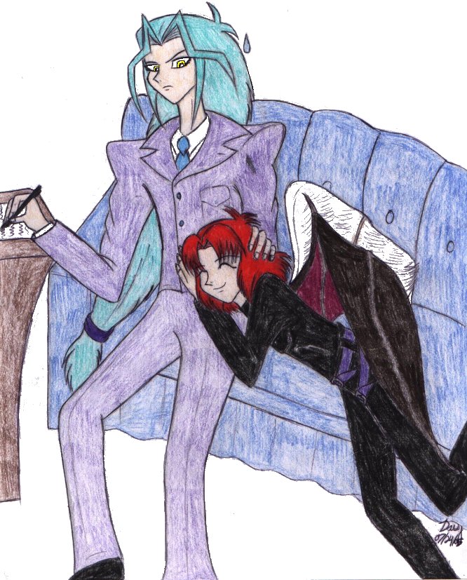
snicker Poor Dartz...he looks like he's thinking, "...You can let go any day, now..."
I like Alexander's positioning, but something about Dartz's throws me off a bit...it might be how close to the edge of the couch he's sitting...there's an awful lot of leg hanging off the edge...he could just be straining to reach his desk, but I'd hope the former King of Atlantis would bother to make himself comfortable by edging the desk a little closer to him XD; The couch is drawn at a good angle for the positioning, but it looks a bit uneven...it helps to draw a parallelogram for the backs of furniture like that, so that the top and bottom lines are at the same angle. It does look like a very comfy couch, though ^_^
As for making digital tweaking less obvious indicates above comment, if you enlarge the picture by 400%, you'll have a lot of space to work with, and you can adjust what you need to with an airbrush set at a 60 to 70% opacity level, then reduce it by 25%. The picture will end the same size it began, but the outlines of your tweaking won't be as harsh. ^^;;


I just knew this picture would come someday. LOL It was only a matter of time. And how utterly adorable it is!
I love Alexander's expression, he's so kawaii. Looks like a content little kitten. And he turned out a little small looking. For some reason I imagined him more of Alister's size . . .
And the art of Dartz's eyebrow continues. Too funny. Interesting concept of how he's doing work at the couch. Perhaps he got a little too annoyed with Alexander pestering him around his office chair. XD
Hmmm . . . I wonder if there's anyway on your Paint Shop program to make the computer tweeking a little less obvious . . .