Crumbling Stone by @Seifer_sama (Seifer-sama C.)
Okay! Time for an original!!!
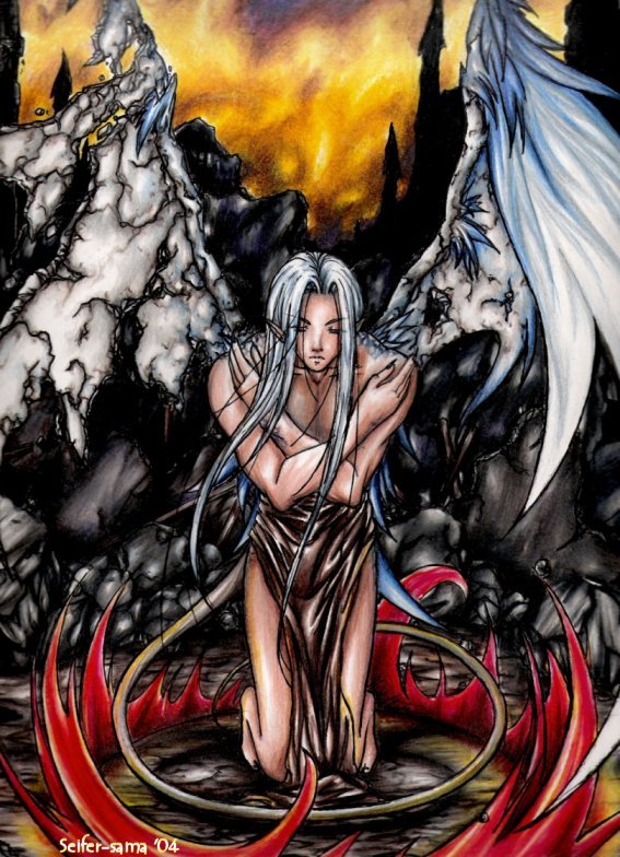
When I first started drawing this... which was the end of August I believe... I wanted to make this guy into a stone gargoyle... but as you can see... that didn't happen. ^^ There was already too much grey in the picture already and I didn't think it needed anymore... so he has skin now. ^^
As for his wings... I was trying to show him changing back after turning into stone for the day. Kind of like in that cartoon Gargoyles. ^^ I thought of doing bat like wings, like the ones in that show... but it just didn't look right on him... I thought the feathery type of wing might be best... ^^
The background took forever... Originally I was planning on doing light colors... but the fire around him turned out so bold that i thought it might not look right... Then my sister came up with the suggestion of doing a yellow background. ^^ bows Thanks sis!!!!
"The castle where his kind used to dwell. Their culture flourished and their numbers were infinate... but as the years passed by their clan's strength weakened like the crumbling castle walls... Until only one was left. Left with the heavy burden of keeping his race alive."
laughs Or at least.... that was my idea behind the picture. ^^ I wasn't ever planning on going any further with it though... although now that I think of it... I suppose it could make for an interesting story... Hm...
Materials - 8 1/2"x11" Computer paper, mechanical pencil, black ink pen, Crayola colored pencils


Fantastic job on the textures, especially the stone on the wings. You showed the transition between the stone and the feathered wings very well. (And I loved Gargoyles, too, so I approve of the concept. grin) Wonderful shading and anatomy, though the upper legs seem a tad long, and I love the dynamic feel all the curved lines in the fire, hair, and tail give to the picture. Kudos to your sister from me, too, 'cause the background does illustrate the story you provided very well, along with the ruins of the castle behind him. His ears are way too low on his head and not far enough back from his face, especially from this angle, but other than that, I see no major issues with this picture. Great job. Hope to see more from you.