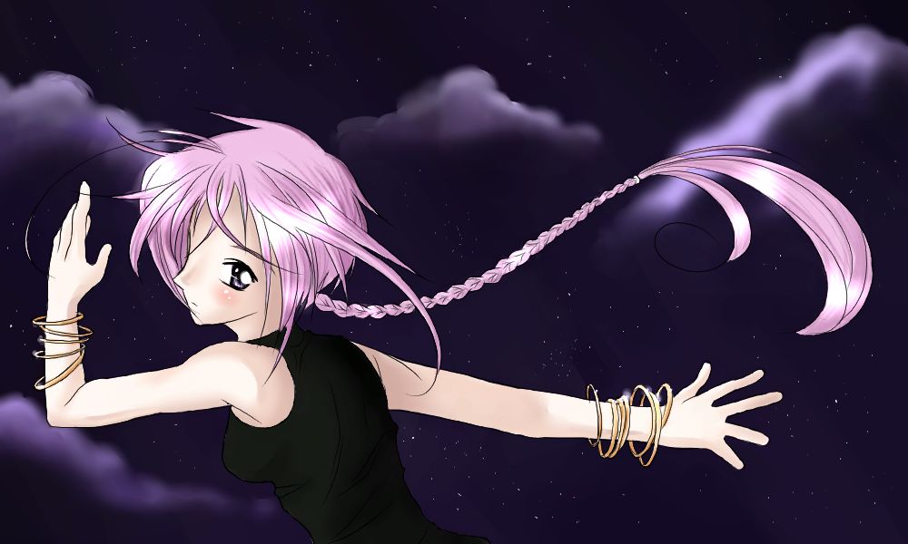
Great job, Eggy! ^^ It's adorable, the background is awesome, i dunno how you pull it off everytime, looks great. The hair and bracelets are great ^^ +thumbs up+

Unseen Dreams - Finished by @Egg (Egg Kaufman)
I finished~! Had a little problem uploading this picture.. I dunno if I posted it twice or not o_o;; oh well.
You can buy this print for 5$ off my website at http://www.tamagonoheya.com!
Comments & Critiques (6)
Preferred comment/critique type for this content: Any Kind
As the others have commented, I love the coloring on the hair and skin, and the background is lovely. The pose is dynamic and flowing, though I feel she should be holding something like a magical card in her hand--she looks like she's doing a ninja-style magic attack. Not that ninjas are magical, that is... er...
I'm a little disappointed in the black of her clothing, however--it blends in TOO well with the background. Adding dark grey highlights to this would alleviate this problem, or any other color except for dark blue. Honestly, it's very hard to differentiate from the actual background, even though the background is blue and she's wearing a dark black-color. Keep the color--just add stronger highlights. I've even seen some character designs that have blue lineart, or some other color, over the black parts of character's costumes, instead of solid black. Also, judging from the light hitting her everywhere else, it would have bolder highlights, at least.
I really do love the background. The soft clouds are so well done! I would love to be under that moonlit sky...
I also disagree with the comments made about the nose-eye being too far away. To me, that appears to be a style thing, and perfectly proportioned for a girl with very wide-set eyes--which I think is quite cool.


I love this pic, especially the shading of the hair! ^^
the background gives a dreamy mood to the picture and her hair and skin comes out very well. one thing that you could fix in this picture is her eye... I think it was placed a bit too far apart from her nose.