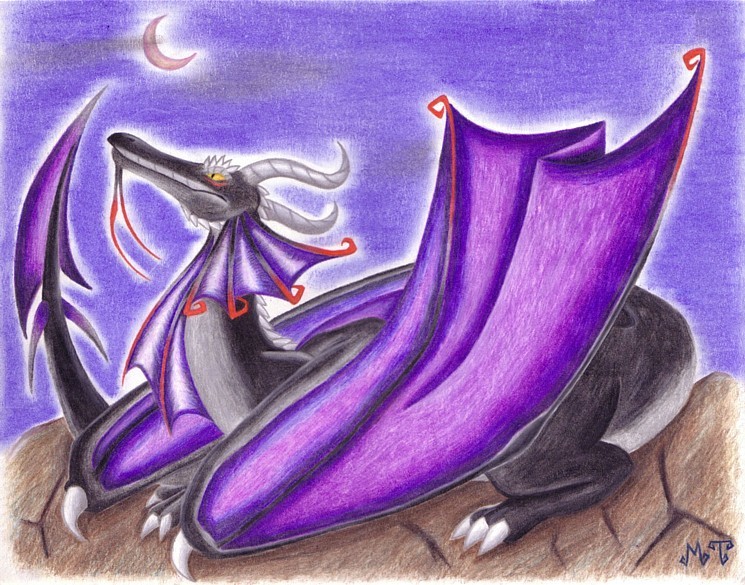
The Black Dragon by @Noodle (Melissa T.)
I finished this picture for a friend about a year ago, it was one of my first pictures using Prismacolor pencils and that awesome clear blender. The design for the dragon came entirely from my head, I call him Blackdust. I really should draw dragons more often, there's no rule to them, you can go wild with designing them. :P


First off, lovely color scheme. Black and purple go so well together. Very nice, smooth shading on this picture and I like your style. The pose is also very interesting, if typical. It works, though. I also like how large you made the wings. So many people draw dragons with small wings they couldn't possibly fly on, it's refreshing to see some relatively realistic proportions.
I'm a little thrown off by the far horn, though. If it's supposed to be parallel to the front horn, then it's too far back on the head and too low. As it is, it almost looks like it's in the center of its neck.
But nice work otherwise. I like the haze around the moon and the glow of the dragon.