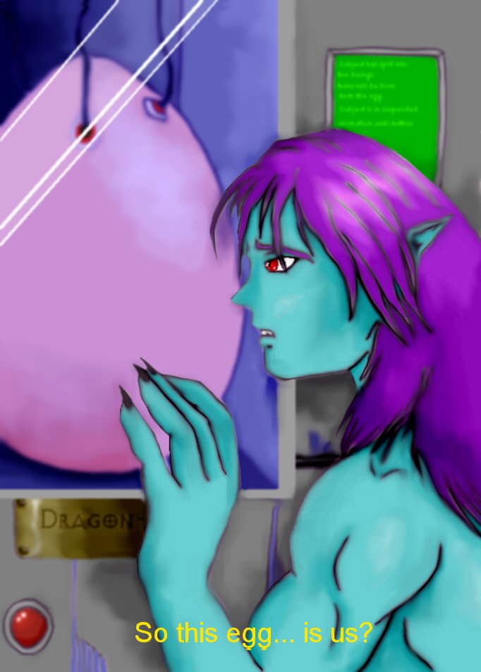
Thanks for the comment. However, if you have ever seen an anime sub, you'll know that the kind of font used is similar to the one I've chosen. The point of it is not to be 'graceful', but to simulate an anime sub.

Civic Hall Screenshot by @Panthra (Rei Easthope)
Yes ladies and gents, what you've all been waiting for. A screenshot from the upcoming anime 'Civic Hall'! Available soon on DVD and VHS! (Yeah, I wish)
What this really is, is a CG that the girl who can't CG is mildly proud of... but I still think it's rubbish.
This is an illustration of an, as of yet, undecided scene where Merlok finds the actual egg that he and Jadine were born from. You see that plaque under his hand? That says 'Dragon-Elf' and that green panel behind his head says 'The subject has split into two, twins will be born from this egg. The subject is in suspended animation until further notice.'
If I do decide to put this in, there's a nifty little mini-plot to go with it too. So yay!


First of all i'd like to say i'm totally unknown with CGing. But maybe you could and try to express some shades a bit more. like under the arm - pit. Another tip, you might do something with the letters try to make them more gracefull, no insult but it looks a little crude now.