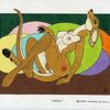
The Logo works for me. I like it. (:)) It shows some of what I can do freehand. I used only a ruler line to keep it even. The animal on the right is an otter who's tail is kind of flat, so depending on how its positioned it might look thin in one place and fat in others. But your right I never noticed that. (;)) Thanks for the comment. (:))

Category:
Rating:
Everyone
Class:
Finished Work
Submitted:
20y159d ago
Tags:
None


That's really cute. It just goes to show that something simplistic is sometimes better than something complicated. The only criticism I've got is about the animal on the left who is like a letter "F". His tail looks kind of funny, the underside of it gets thin then fat again. But other than that, good work.