@psy
A Hodgson

Forest and Erhina
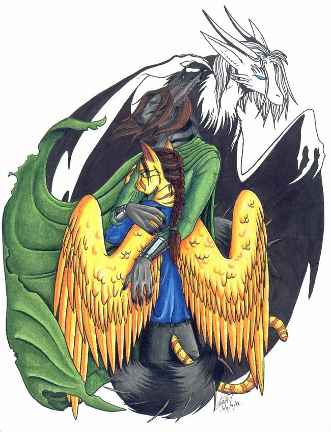
Forest and Erhina by @psy (A Hodgson)

A picture I did for Er's player of Furcadia Forest and Erhina. Cute ^^ . The dragon is Forest's true form. Artwork © Copyright 2002 Adelle Crowe

Category:
Rating:
Everyone
Class:
Finished Work
Submitted:
22y114d ago
Tags:
None
Other Work By @psy

Comments & Critiques (7)

Preferred comment/critique type for this content: Any Kind

Posted: Friday, 02 August, 2002 @ 03:28 PM

O.O wow........ this is great! ^^ It's really bringing Furcadia to life for me. :3 I just wanna huggle them! The golden cat (Erhina?) looks great, and the way you did the wings and everything is great! Perfect piece! :D

Posted: Friday, 02 August, 2002 @ 05:07 PM

Yesh, I keep on commenting, dern it! You get better at feathered wings everytime you draw!! is inspired THAT's how they look when they're folded! I'd always wondered! Very, very beautiful, (again. hee hee) I like the braiding of the hair.
Posted: Tuesday, 04 November, 2003 @ 02:20 PM

Wow, that's some great pic there. I'm not sure what you used to color it with but it's very gud. Their positions and all are well drawn, I like how you drew her french braid :)

Posted: Sunday, 21 December, 2003 @ 03:38 PM

I saw this as the artist of the day today and just wanted to say that I think the coloring is beautiful. I love the soft fine textures of the colored pencils.

Posted: Sunday, 15 February, 2004 @ 09:15 PM

Wow, this rocks. I love how the cape actually looks like its billowing. A lot of people -cough- ME -cough- don't know how to do that correctly. You pull it off perfectly. I love how you put his true form in the background. They look so real. Three cheers for furcadia and you!

Posted: Saturday, 15 May, 2004 @ 09:30 AM

Simply gorgeous! Love the colors, and the pose.

The cloak looks like it's been folded, rather then flowing and caught up in the wind, but then again that could be cause you wanted to keep it in "frame".

Still, amazing work! Love it!

Posted: Friday, 17 September, 2004 @ 05:07 AM

Very beautiful, this is very nice, all the proportions are done very well, only thing i'd say is that the green dudes left arm might be in too far, i mean the starting shoulder location. however, i think that the angle that he is standing may account for that. the shading is excellent, and all of the folds on the clothing give this a very real feel to it. great job.

Sincerely, Ikaika

Leave a Comment

You must be logged in and have an Active account to leave a comment.
Please, login or sign up for an account.

What kind of comments is psy seeking for this piece?

  • Any Kind - Self-explanatory.
  • Casual Comments - Comments of a more social nature.
  • Light Critique - Comments containing constructive suggestions about this work.
  • Heavy Critique - A serious analysis of this work, with emphasis on identifying potential problem areas, good use of technique and skill, and suggestions for potentially improving the work.
Please keep in mind, critiques may highlight both positive and negative aspects of this work, but the main goal is to constructively help the artist to improve in their skills and execution. Be kind, considerate, and polite.