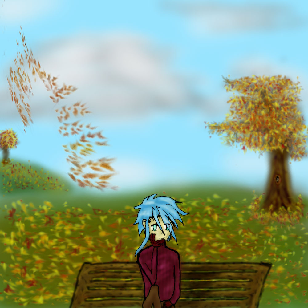
Wow! This is pretty good! Background looks very realistic in places and yet very surreal. Like an expressionist's painting! Niel's pretty good too. The only thing wrong with it is how small his hand is. Other than that, it looks pretty damned good! I had no idea would draw that well by hand! ^^ Great job!

Autumn Park by @Jansu (Brandon Ballenger)
Been a while since I've posted anything, namely because I haven't done anything. Stress and lack of inspiration have kept my creativity to a minimum for the past month or so, but I pulled myself out of the slump enough to do this birthday image for my wonderful friend Amy.
I was really eager to do this, because last year I'd tried to do a picture of Rin for her and it was so horrible I threw it out and gave up. Since I've been doing more art this year, I felt better equipped for an attempt at something. I didn't want to stick with my original idea of Rin holding a sailboat carving, though, so I needed to come up with something else. I'd been thinking for a few weeks, I'd try to do some sort of bishounen or something. No particular ideas were coming to mind. And then early one morning (around 2 AM) I just woke up and knew what I wanted to do. I was way too tired to start the lineart, but I opened up Photoshop and started on the background. After forty minutes it looked something like what it does now, minus the hill and second tree and the bench. And the trunk shading. I did all that the next morning since I fell back asleep shortly after. The squirrel and the hollow were the last things I added to the background, though I did end up detailing the bench more as well.
As a consequence of doing the background first, it kind of dominates the image. Which is, honestly, okay with me, because I'm not very confident in my lineart. Most of my stuff has been digitally drawn, and I haven't made very many attempts at actually hand-drawing people. I did a page of face sketches for Niel, trying to get that down, knowing that it would be up to his face to identify him so if nothing else it was vital to nail that.
And ultimately, I ended up doing the lineart in several parts, drawing and scanning, back and forth. I didn't want to get something that looked decent and then ruin it after. I was really nervous through the whole ordeal, but it came out okay.
I thickened up the lineart a good bit in Photoshop (since I'd just done it in black pen - I don't have any inking implements or anything). The hands were digitally drawn, and not unexpectedly were the most troublesome. I had intended to snag my sister's digital camera and do a shot of myself for the pose, but unfortunately her boyfriend had it at the time, and I couldn't afford to wait to finish the picture, so what I ended up doing was pulling the mirror out of my bathroom cabinet and propping it up on my bed, then sitting down and trying to sketch it out. It kept coming out horribly so I just did it digitally. It still looks crappy to me, but trust me, it's better than it was.
After that it was pretty straightforward, coloring was an easy process after the rest. The gloves have a pre-made texture because I didn't want to make them shiny leather or something and didn't know what else to do with them. The turtleneck sweater was a simple matter of adding dark lines to give it the folds. I'm sure I could've made it a bit more intricate if I had enough time, but I couldn't think of anything else for it then. Perhaps dodging on the edges of the dark lines.
This version I'm posting here is the full-sized version, what I actually worked with. The version I gave as a gift was smaller (most of my images look better smaller, in my opinion ^^;;;), but since I'm looking for constructive criticism it seems best to post the full version.
Hmmm....I guess that's pretty much all I can think of to say. Happy birthday again, Amy. ^_^
Comments & Critiques (3)
Preferred comment/critique type for this content: Any Kind
hugs You know I love this. I know I'm horribly biased, so I'll just say a few thiiiings.
Gift art is an interesting thing, and you have succeeded here in two significant ways! First, you've taken the character's personality into consideration (which is a feat, since I divulge so little about him at this point), which shows by the perfect environment you placed him in and his activity. Second, in addition to creating a work of art that the giftee (me!) would love, you also expanded your skills and produced an image that anyone can appreciate. ^_^ Congratulations, and thanks again!


Wow, it's such a cute picture! The leaves are pretty realistic, especially the ones that are still on the trees. And the detail to the ones blowing in the breeze looks great! All that must've been so time consuming! The leaves in the center of the grass (behind Neil) look almost as if they were slightly less "solid" than the ones on either side. The grass also lacks solidity. Perhaps if grass strands were added, too...? But that would've taken even MORE time than this already did... ^^;;;; Maybe something for next time... ^^;;;
Neil himself is adorable! Nice simple lineart is good, and nice texturing and shading with the sweater and bench! The subtle color difference between the sweater and bench rreally help differenciate one from the other--glad you took my advice there! ^-^ Arms and hands are a real pain--they didn't turn out too badly, though I think his ring finger would bend a little, and also the middle finger should be the longest of them all. Also, arms and hands are thicker than you have them there (I used to draw really thin ones, too, for a while... ^^;;;;)
Really, your handdrawn stuff isn't as bad as you've made it out to be, and you're very masterful with backgrounds! I'm looking forward to moooooore pictures!