Thanks. ^^
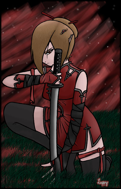
Hmm, I guess you're right, it does look too short but it's really not that short ... what I mean is that the grass in the foreground sort of covers it up; I guess I should fix that later. And the right hand is too small ... I guess I overlooked that.
Anyway, thanks again.


Nice details. The intricacies of this costume, right down to the earring and clip in her hair, really stand out in this picture. It's obvious you put a lot of thought into this character's design and it paid off. Personally, I like the background. It has a nice surreal quality to it and the color scheme works with the foreground. The perspective of her left leg is off - it looks like it's too short because of how high up the grass goes - and her right hand is a little small, but otherwise it's nice work. Keep it up.