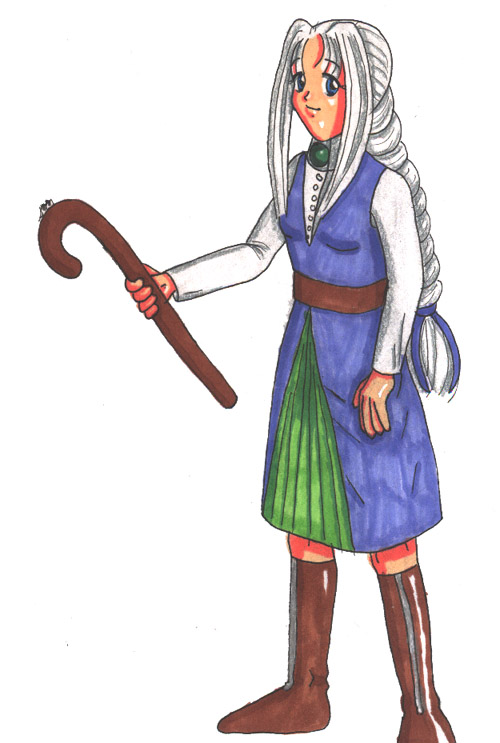
I've always demarkated knees like that, actually... ^^;;;;
As for the hands, yeah, they do look kind of weird... ^^;;; But the line on her right hand below the thumb is actually marking the fat/muscle that connects the thumb to the hand.
@smarle
Staci/Nadia

Here's my FFB character, Emilynn, again, this time full-sized! I wanted to do a quickie design sketch of her for my friend Amy (Amy Amarao here at Side7), but I decided a color picture would be better than a simple sketch (not to mention my sketches are too messy to be very clear... ^^;;).
It's not a very neat picture... The coloring in the green pleated underskirt is particularly irksome, and her skin should be quite a bit paler than the marker colors I have, but it shows off her design well enough. I love her hair... :D But that cane is definitely one of those wussy wooden canes RPG characters tend to start off with... ^^;
Done with pencil, Micron pens, Prismacolor markers and pencils, and my good ol' white gel pen.
Preferred comment/critique type for this content: Any Kind
I'm glad to see Emilynn again! As a whole, I really like the coloring, personally. Maybe the skin is darker than you wanted, but it does work well enough. I particularly like the hair.
I also really like the crinkles at the elbow in the fabric of her right arm, that makes an excellent dent in bringing out the perspective of the whole thing.
I don't see anything terribly bad about the pleats, I think it's the lines on the outer part of the skirt that look odd...I don't have a problem with the knee marks...
I agree that her left hand looks awkward - perhaps too plump or perhaps the pinky is a bit long or too angled. I'm not quite sure. The right hand doesn't seem so bad even with that line, but perhaps it shouldn't go all the way from the arm to the cane? I'm not sure.
The cane itself, I wish you'd get a little more creative with, but aside from that...
Well, good work on a non-SD Emi! :D
Weeeeeeeee, all of a sudden, it hits me what line you and Red are talking about on her right hand... ^^;;; Boy, I'm dense... ^^;;; Yeah, that seems to make it look like her thumb is going in the opposite direction... ^^;;; As for her left hand, there's definitely something odd about that pinky... ^^;;;;
The lines on the outer part of her skirt are marks from her leg pointing out... Those probably could've been done better... ^^;;
Maybe next time, I'll do a different, better cane... ^^;;;
Thanks for all the comments! ^-^
I don't think the underskirt came out SO bad... I'd say the outfit came out fairly well. And yeah, the hair looks pretty good. I'd take issue with her hands and knees myself, though... I'm not sure denoting the bone with the lineart like you did was a terribly attractive idea... :\ As for her hands... Her left hand seems unusually plump and her right hand... :\ That line below her thumb probably shouldn't be there... But other than that... ^^;;;;;;;;;;;;;