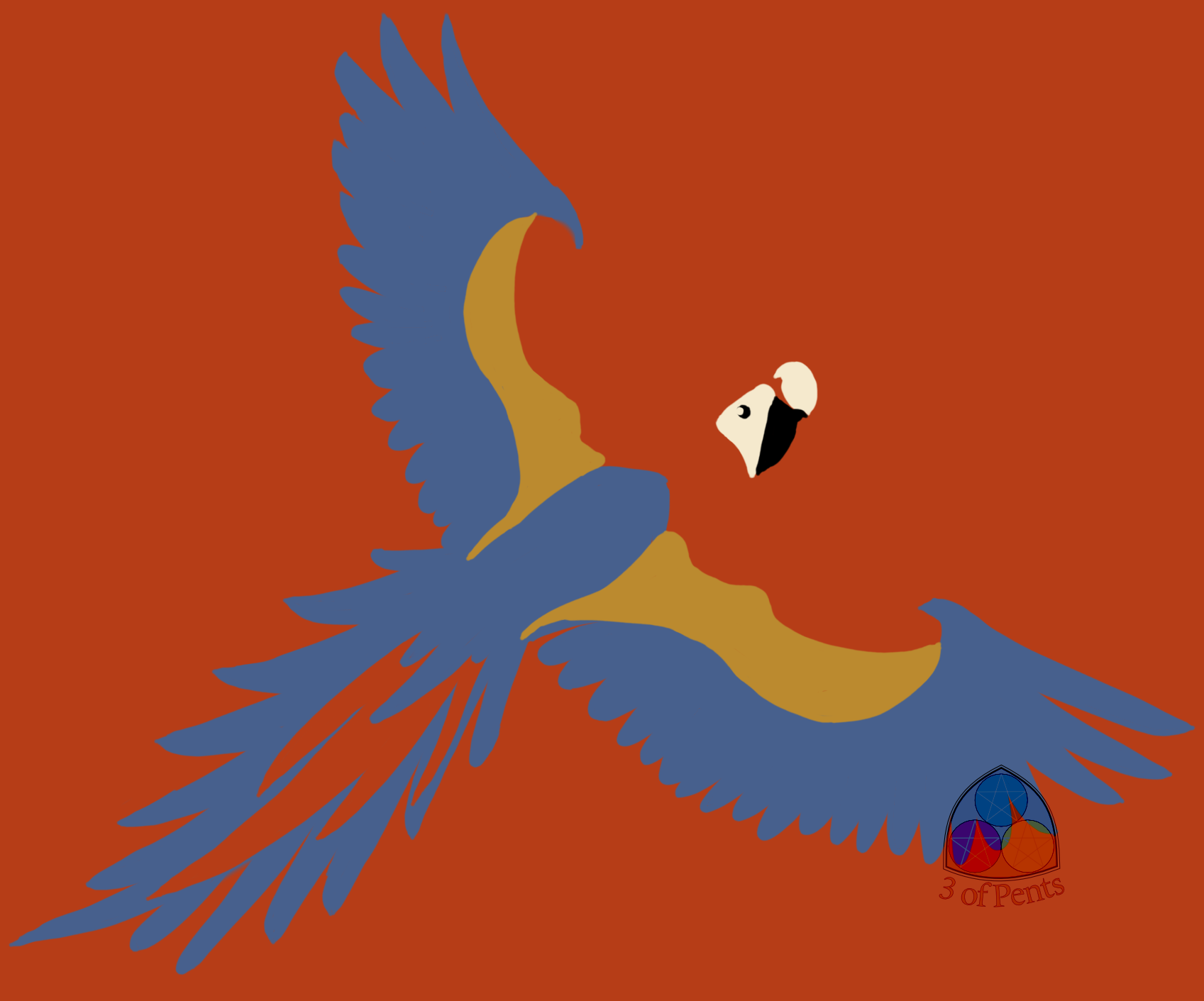
100 Palettes Challenge // Palette #8 // Macaw by @3ofpents
Another bird! What can I say, I love birds.
This palette comes from a German (I'm pretty sure) postcard from 1907.
So last spring, I went back to school to get some graphic design credentials. In one of my classes we were assigned to make a series of pieces exploring the gestalt principles of grouping. I decided to focus on pigeons to give myself a palette and a cohesive theme to work with, and one of my favorite pieces I've ever done with part of that assignment. It was just a pigeon where the main body was the same color as the background, so the shape is created by the other markings. You can see it here.
Like I said, I really loved that piece and when I originally saw the 1903 palette I really wanted to make another piece like that with a macaw. But I just didn't have a light color to do the face with, so I did the red-winged blackbird instead.
I was a little worried that the colors were too dark, particularly the yellow. In the postcard, the yellow looks very brown. But the postcard is mostly blue and the yellow is used on a few pair of pants, while this piece is mostly red and, of course, the yellow is on a bird instead of pants. But it's a great example of how both recontextualizing and rebalancing a palette can completely change how the colors look.
Comments & Critiques (0)
Preferred comment/critique type for this content: Any Kind


Leave a Comment
You must be logged in and have an Active account to leave a comment.
Please, login or sign up for an account.