@Sesca3
Sesca Thor

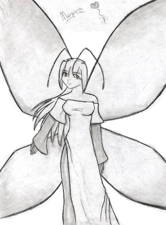
Redesigned Meriph
Redesigned Meriph by @Sesca3 (Sesca Thor)

'Nother doodle from the free day in English class! I had fun with this one. ^_^ I decided to make her wings thinner and more fairy-like so it looks like she's not about to fall over backwards every time I draw her. Honestly, her old wings looked HUGE, heavy, and cumbersome. She looks a lot better now, even older. I think that's because she's got those half-lidded eyes (her eyes are normally a lot bigger).

Anyhoo. I like drawing Meriphra. She's spiffy. ^_^

Artwork © Copyright 2002 Jessica Thor

Category:
Rating:
Everyone
Class:
Finished Work
Submitted:
21y337d ago
Tags:
None
Other Work By @Sesca3

Comments & Critiques (0)

Preferred comment/critique type for this content: Any Kind
Leave a Comment

You must be logged in and have an Active account to leave a comment.
Please, login or sign up for an account.

What kind of comments is Sesca3 seeking for this piece?

  • Any Kind - Self-explanatory.
  • Casual Comments - Comments of a more social nature.
  • Light Critique - Comments containing constructive suggestions about this work.
  • Heavy Critique - A serious analysis of this work, with emphasis on identifying potential problem areas, good use of technique and skill, and suggestions for potentially improving the work.
Please keep in mind, critiques may highlight both positive and negative aspects of this work, but the main goal is to constructively help the artist to improve in their skills and execution. Be kind, considerate, and polite.