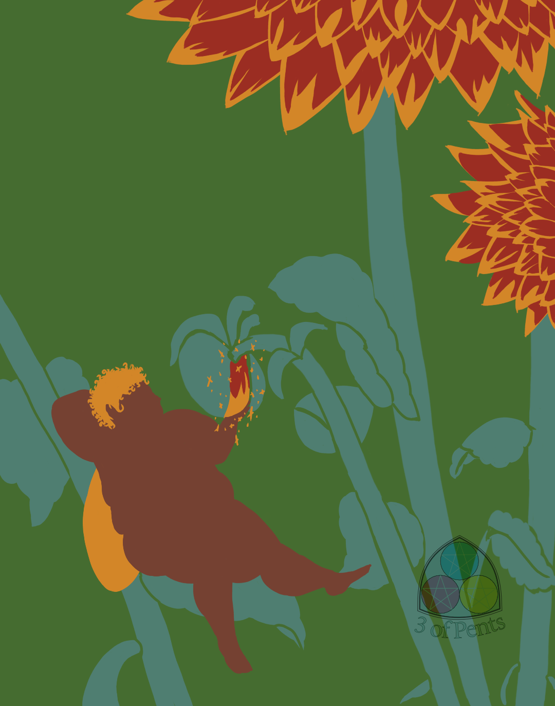
100 Palettes Challenge // Palette #10 // Lady Dahlia by @3ofpents
I know I'm late again this week. I'm in the midst of a lot of school stuff. I've mentioned, I think, but I've gone back to school to get a graphic design certification. I started last Fall and it was my hope to be done by this summer because the certification programs are designed for adults with careers who want to expand their skill sets and so are pared down to only the classes that are directly relevant to the subject matter. In my case that's only 9 classes, so 3 per semester. But unfortunately I had to withdraw in the Spring because of some health issues. So now I'm trying to pick up where I left off after the school went and changed a bunch of their online systems. So now I get to try and recover my old accounts on their new system and deal with class requirements that don't exist for my program, but apparently exist now for individual classes that are required.
And on top of that we're prepping our toddler to go to daycare, which comes with A LOT of paperwork and supplies lists and doctor signatures and also EMOTIONS.
Anyway.
Today's palette comes from a poster that appears to have been an activist piece of art. I've tried not to go into too much detail here about the posters since the bulk of this book is the palettes and the pieces they were picked from. I'm already posting every single palette in the book, so I'd rather not include the posters also. But I just love this one so much, I have to at least share the information so you can look it up yourselves. It's called "Dig" by Sadie Wendell Mitchell, it's part of a series she did called "Girls Will Be Girls". It depicts a young woman perched on a chair engrossed in a book, and also surrounded by stacks of books. Only a few of the books have visible titles, "The Study of Bugology", "The Psychology of the Male Human", and "Economy" (the one she's reading). And on the wall you can see part of a poster that says "DO IT NOW".
It feels like a very pointed protestation as a poster designed in 1909.
I struggled with this palette a lot. It's not only very similar to a lot of the previous palettes, the values are just so similar, particular with the green and teal. It works fine in the original poster because Mitchell used a heavy black outline, but the author of the book chose not to include that in the palette.
I actually started a completely different piece that going to be a face study, but I just didn't like the way the colors were playing together. So I ended up scrapping it.
So I pulled back a bit. Our dahlias have started blooming and the first ones to pop were these gorgeous red and yellow blooms, and I've wanted to draw a fairy for one of these for several palettes so far, so I did it.
The dahlias were SO much easier and more fun to draw than the peony was. They're so geometric, I really just enjoyed layering the petals and the colors.
I attempted to give the fairy some petal clothes, but it just wasn't doing what I wanted it to do. And I think the form is distinct enough to make her out. I do really like the effect of the teal on the green; the heavy similarities of them both make the fairy and flowers pop more. I do wish I'd filled in some more greenery in the background, but honestly I'd spent so much time on this palette already I didn't have it in me.
I'm really pleased with the final result, though, and I doubt this will be the last fairy piece in this series.
I want to shout out Fat Photo Ref again. I used them for the pose and the hair for the fairy and I remain exceptionally pleased with the range of references available and the easy navigation.
Comments & Critiques (0)
Preferred comment/critique type for this content: Any Kind


Leave a Comment
You must be logged in and have an Active account to leave a comment.
Please, login or sign up for an account.