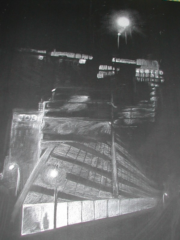
Its not Orange! by @Sedo (Nara Van Rossum)
Bad picture. too large to scan, but i like it. I might put it up on my wall to replace some'o the old stuff! One building taken from far away at the top, to very close up at the bottom. The building is unfinished which is evident in the middle layers, and a beatiful form on top that is the almost alien, almost religious or mythological, structure of the the lighted legs of the constuction crane.
... And its not Orange!
3 orange tinted things then everything is back to black and white again.
Thats what I call progress! (sarcasim, sarcasim.)
Comments & Critiques (0)
Preferred comment/critique type for this content: Any Kind


Leave a Comment
You must be logged in and have an Active account to leave a comment.
Please, login or sign up for an account.