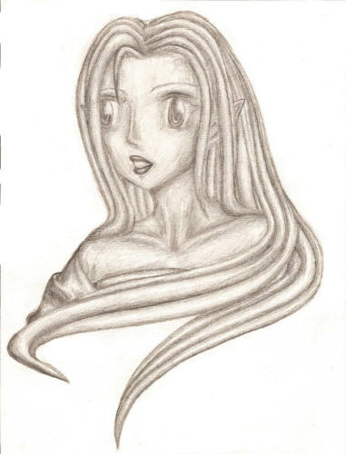
I hate drawing noses. It seems to me the problem is more on her left side since I did not finish shading the area between the eye and nose. Not to mention the scanner did not pick up any of the shading in the area. Her nose might need to come out further too at that angle...I am not really sure...

Shaded by @nolani (Lindsay Gordon)
She is still in a very generic position but I was trying to add a lot more shading than typical in my anime.
Comments & Critiques (3)
Preferred comment/critique type for this content: Any Kind


Oooh, I really like how this turned out. The shading really brings more life into the picture and yet . . . makes it look like a stone statue, or one that was turned to stone. My favorite has to be the eyes and the detail in and around them. It seems a bit more than usually and really awesome. It really looks like there's light reflecting off them. I also really like the shading around her neck and collar bone. Makes it look more realistic.
The only thing that bugs me is the nose. In a way it seems too small, but I think it might be due to the shading. It almost makes look . . . flattened? I think if that were erased and touched up again, it'd be fine.