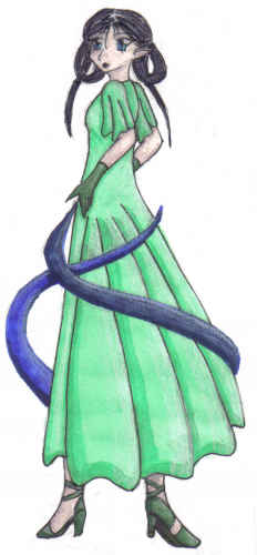
It's really good to try out more poses! I think that this is a very interesting one, and a bit challenging, so I admire that you drew it. Overall, it's very well done--the major issues are in the folds of the dress. Like I used to you, you tend to draw a fold as one line, without a real specific point of origin. Try looking around at people (assuming you're in a room with clothed people!) and observing how wrinkles form. Generally, they're more 'triangular' than linear, and all form from certain points. For example, in this image, the cloth would lie 'tightest' against her hip, and the wrinkles would flow out from the sides of her hip bone. Sometimes it helps to draw the character nude first, to determine where exactly the wrinkles should be originating. I hope that I have made some sense here...
This image is a little blurry, as well, I don't feel this scan does it justice. What dpi are you scanning at? For best quality, try 300 dpi. The option to change that should be in the 'advanced mode' under whatever program you are using. Also, programs like Adobe have noise reduction filters that can be very helpful, although if your image is scanned small, it will make the image seem very blurry instead.
Okay, one more thing--if you gave her a small shadow under her feet, it would give the image more depth. :) I really do like the colors you've chosen here, and I hope to see more of your new poses. :) Don't forget How to Draw Manga books for GREAT pose references!


wow dude, thats super cool. I really like her hair. wootwoot.